Chapter 2
Frequency distribution and Graphical representation of data.
Our focus in this chapter is the classification and representation of statistical data. The frequency
distribution and graphical display are widely used methods that are popular among statistics user community
for classification of data.
 Frequency distribution is a process of organizing raw data in the form of a tabular representation, in which one
column represents the values of the variable that occurs in the data set, and the next column represents the
frequency of each value of the variable, that is, how often the value of the particular variable or the range
of the variable is getting repeated in the distribution. In a simple sense, it is the count of repeated values of the
variable. And visual display is the representation of the data set in a suitable diagrammatic form.
Frequency distribution is a process of organizing raw data in the form of a tabular representation, in which one
column represents the values of the variable that occurs in the data set, and the next column represents the
frequency of each value of the variable, that is, how often the value of the particular variable or the range
of the variable is getting repeated in the distribution. In a simple sense, it is the count of repeated values of the
variable. And visual display is the representation of the data set in a suitable diagrammatic form.
We shall consider the examples, how we can create a frequency distribution and data display for qualitative
as well as quantitative data.
Qualitative data:
The qualitative data lists names and labels of certain characteristics. In the following example we shall
consider the letter grades of students in an semester exam.
Example:
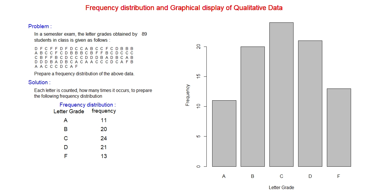
The above data set consists of letters A, B, C, D, and F. These are the values of the variable “Letter Grade”
which is listed in the first column of the frequency distribution table. Each value of the variable is counted
how many times it occurs in the dataset, this number is listed in the second column corresponding to the letter grade,
called frequency. This whole table constitutes the frequency distribution of the qualitative data, on the left side of the above figure.
This frequency distribution of the data set can be suitably represented by a bar diagram which is shown above on the righ side.
In the graph, the horizontal axis represents the letter grade and the frequency along the vertical axis. The horizontal axis is
labelled with values of the letter grade, corresponding to each letter grade a rectangular bar is erected with a height proportional to the
frequency. All the bars has the same width. Vertical axis is scaled with frequency. A suitable title is placed at the top of the graph. Axes labels
"Letter Grade" and "Frequency" are placed along horizontal and vertical axes.
Quantitative data:
Quantitative data are numerical, such as counts and measurements. Examples include income, expediture, sales, average
rainfall, length, area, volume, age etc. Mathematical operations are valid for quantitative data.
Example:
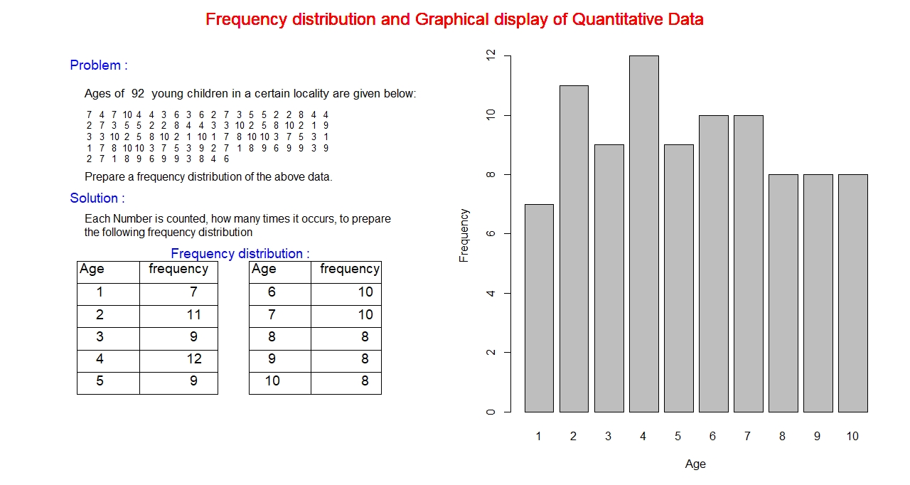
The data set in the above example is quantitative, the age of young children. Young children of ages 1 through 10 is considered
in this example, that is, the variable : Age can take any values between 1 and 10. On the left hand side, the frequency distribution
of the data set is presented. The first column is the variable: Age, the possible values 1 through 10 is listed below the variable
name. The second column is the frequency, which lists how many times each variable is getting repeated in the distribution.
Bar graph on the right hand side is the graphical display of the data set. Both the axes are numerical. Horizontal axis represents the variable age
and the vertical axis, the frequency.
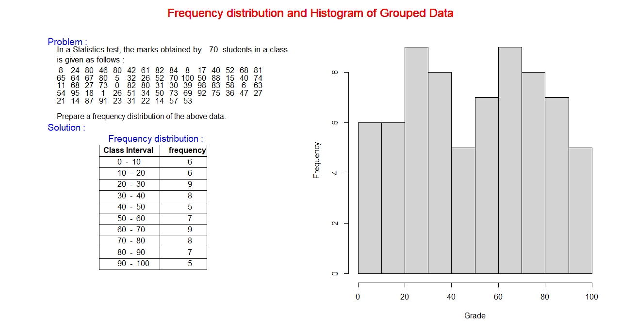
Grouped frequency distribution:
In the above examples, the range of the data set is relatively small, in the first case it is only 5 and in the second case it is only 10,
so in such cases the ungrouped frequency distribution is a reasonable representation for data distribution. However, there are situations
where the range of data set is very large, for instance if we consider the numerical grade of the test with a 100-point scale. Then we would
have 100 possible values of the variable grade, then it is not possible to write all 100 values in the variable column of the frequency distribution.
So, in such situation, we would consider the grouped frequency distribution to represent the data set, in which a range of values called interval
is written instead of a single value of the variable. A graph called histogram would be the appropriate choice for graphical display of the data set.
Procedure:
First, we shall discuss a procedure for constructing a frequency distribution in the following steps, then we will take an example to have the better concept of grouped frequency distribution.
- First we should decide the number of classes to consider for the given data set. General practice is to take from 5 to 20 classes. According to the available dataset, 5 is the appropriate
number for class if the range is small, and for the large range we can go up to 20, not more than this number.
- We would estimate the width of the class, by taking the ratio of range of the dataset to the number of class and rounding it to a suitable number.
- Class limit consists of two values lower limit and upper limit. Lower class limit is the smallest number in a particular class and upper limit is the largest number in that class.
First, lower limit is the minimum value of the data set or some appropriate value slightly less than this value. Upper limit is the sum of the lower limit and the width of the class.
Accordingly, all the classes for the dataset can be created. Last upper limit is the maximum value of the data set or an appropriate value slightly larger than the maximum value.
- Find the frequency of each class by counting the data values that lie within the class.
Frequency distribution and Graphical display:
Pictures and diagrams catch vision (eyes) faster than any other form of text materials.
In the early days, there were not very many developed devices for creating pictures and diagrams,
rarely, the physical quantities used to be represented graphically. But due to the advent of computer
and advanced digital technology, during 19th century, the creation of graphs, and images is so handy that
almost everything of any aspect of life and culture can be seen in the form of visual display now.
Similar to a bar graph, the quantitative data set with uniform width is represented graphically by a histogram, connected rectangular columns of height proportional to frequency,
as shown in the following figure. Vertical axis represents counts of data points in a class, labeled frequency. Classes are marked along horizontal axis. Each class is the width of a bar. Both the
axes are labeled with real numbers, frequency along vertical axis and the class boundaries on horizontal axis.
Example:
Class Boundaries:
So far, we were discussing the frequency distribution with connected class, which can be represented by a histogram graphically.
But there are situations where the classes are disjoint, that is, if we consider the consecutive classes, the upper limit of the
lower class is not same as the lower limit of the next upper class, in such situation data set cannot be displayed using histogram.
So, the task here is to remove the gap in between the lower limit of the class and the upper limit of the next class in a consecutive
class. The gap can be removed by shifting halfway both lower and upper limits, that is, move up the lower limit by halfway and move
down the upper limit by halfway. This can be accomplished by adding both lower and upper limit and then divide the sum by 2,
this new number is called the boundary, that is, the upper boundary of the lower class and lower boundary of the upper class.
Similarly, we can adjust other boundaries as well.
For instance, we can consider the age distribution of young children discussed above in the example of quantitative frequency distribution.
We can see the bars are not connected because the values of the variable age are separate and not connected. We can construct boundaries as
discussed above for this data set that creates the connection and can be displayed using histogram.
Example:
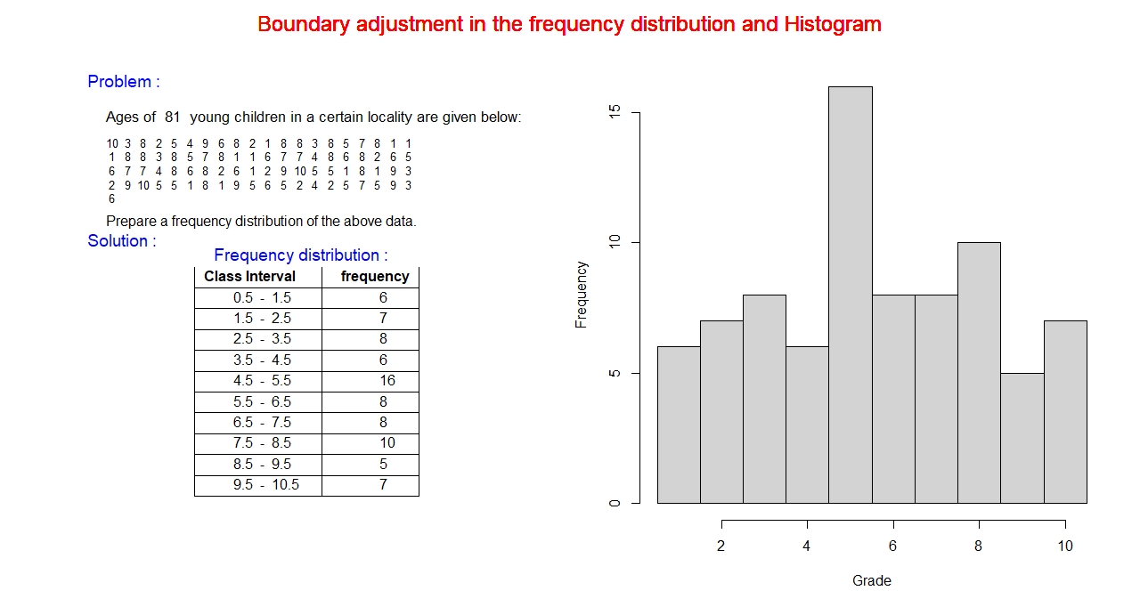
The ages of young children ranges from 1 to 10, integer numbers. The values of the variable considered in the previous example. Now, in this
example we are trying to convert these point values in an interval. The process is back and forth for each integer value by 0.5, this can be
seen in the above frequency distribution table.
Mid -value:
We have discussed the grouped frequency distribution, a tabular representation of data consisting of class interval in the first column
and corresponding frequency in the next column. The data values are presented in the form of class interval which is not suitable for
computational purpose. So, from the interval data we need to explore a single representative value of the interval which can be used for
mathematical operation. One of the most widely used value in this respect is the middle value, in short it is called mid-value,
which is the average of lower and upper limit. It is calculated as the sum of lower and upper limit divided by 2. For example,
if we try to find the mid-values of the interval in the age distribution that we discussed above, we get the mid-values:
1 through 10, the values that we have started first.
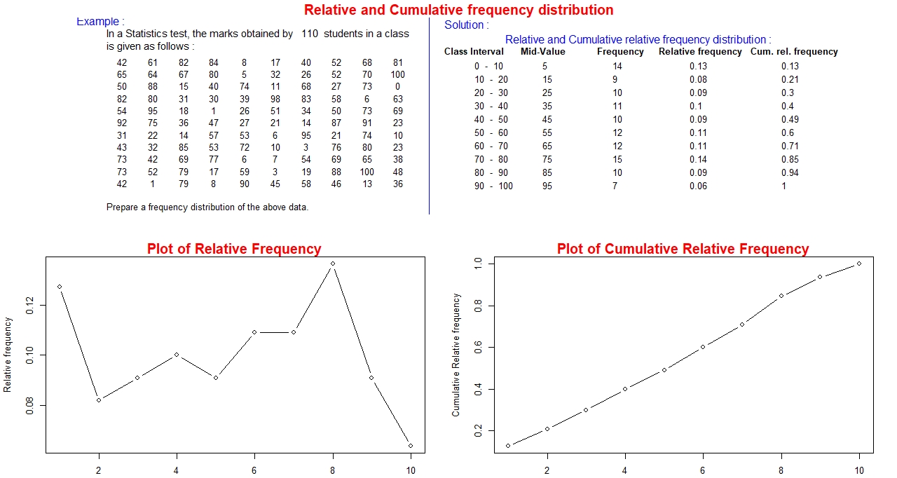
The frequency distribution we have discussed so far consist of two columns, the first for the variable values and the second
for the corresponding frequency. Now, let us extend this frequency distribution with some more columns, namely the relative
frequency and the cumulative frequency. Before going in detail, we shall try to define what these terms actually mean.
Relative Frequency:
It is the fraction or the percentage of data set that falls within a specified class.
In each class it is computed as the ratio of the frequency of that class to the total frequency. Since each
relative frequency is a fraction to the total frequency, so, the sum of all the relative frequencies must equal to 1.
Cumulative Frequency:
It is also called the running total of the frequencies, a special type of sum of the frequencies.
It is the sum of frequency of the current class and the frequencies of all the classes below the current class.
A good check here is the cumulative frequency of the last class is equal to the sum of all the frequencies.
As an example, we shall compute the relative frequency and cumulative frequency for the data set of grade in statistics.
Example:
Graphical display of dataset :
While discussing frequency distribution we have referenced some of the graphical display of
data set in the context. Now shall discuss in detail, how the data set can be displayed in
different types of graphical form. It is an unproven fact that the graphs are eye catching
and furthermore, it is much more visually appealing than any form of tabular representation of data set.
There are tons of different types of graphs in a pool to choose from for displaying the data set.
At this point it is our responsibility to choose the most appropriate graph that suits the given
data set because not all graphs from the pool can suitably represent all types of data. Therefore,
we shall highlight some guidelines for appropriate choice of graph for a given data set.
As we know from chapter one, the types of data set: Qualitative and Quantitative. The types of
graphical display also differ accordingly. We shall be discussing each case in detail.
First let us try to list the graphs that are suitable for qualitative data set.
The widely used types of graphs for qualitative data are: Pie chart, and bar graph,
which is discussed in detail below.
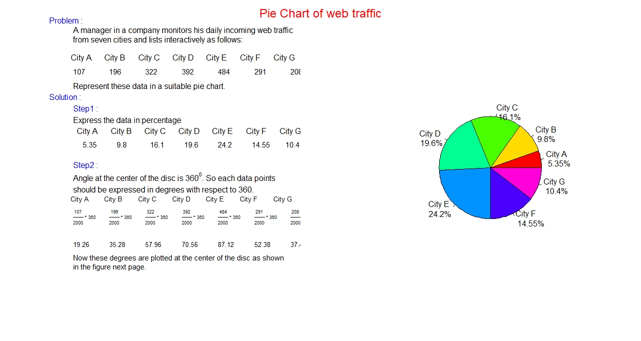
Pie Chart:
It is a circular graph, that is, data set is presented in a circle. It is suitable for nominal data.
The whole data set is displayed in a single circle, each component of the data set is presented
as a slice of the whole circle. So, it is easy to find the percentage contribution of each
component data as compared to the whole data set.
Procedure for creating a pie chart:
- Express each component part as fraction or as percentage of the whole data set.
- Since we are trying to display the whole data set in a single circle, so each
component part is a slice, that starts as a tip at the center of the circle and ends at the
circumference of the circle as a segment. It is well known that the angle at the center of
the circle is 360 degree. So, we need to find the share of each slice at the central angle,
calculated as follows:
- Multiply each fraction (component divided by total) by 360. This central angle is
the contribution of the component part. We can draw this angle at the center using
suitable geometrical device.
- This process is repeated for all the components.
- Different colors can be used for distinct visibility of all slices.
- Label the components with their share in percentage and write a suitable title at the top of the graph.
Example:
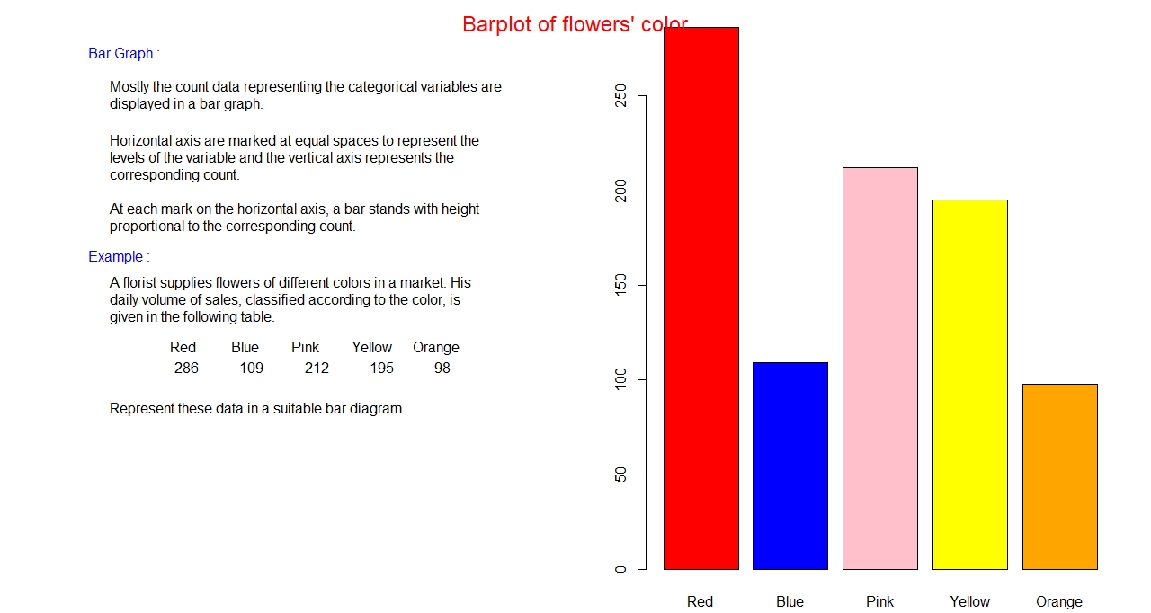
Bar graph:
A bar graph is a rectangular column graph. Though one dimensional it is presented in two-dimension plane.
Horizontal axis represents the category, especially names and labels, and the vertical axis represents
the amount (count) of data in each category also called frequency. All the bars have the same width. The bars do
not touch each other. The height of the bar is proportional to the frequency.
Procedure for creating a bar graph:
- First label the horizontal axis with all the categories in question and mark a suitable (same)
width for each category at the horizontal axis.
- Assign suitable numerical scale for the vertical axis to represent the count or the frequency of the category.
- Make a bar (vertical column) at each labelled category with a height proportional to the frequency.
- Use a suitable color to make the bar graph a pleasant look.
- Label the axes and write a suitable title at the top of the graph.
Example:
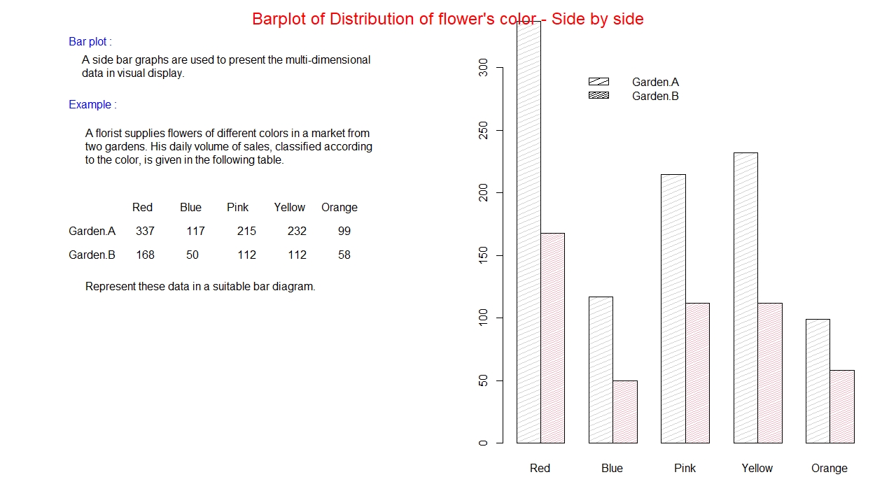
Side-by-side Bar graph:
If we want to compare same category but for different groups, or we can better say sub-categories,
a side by side bar graph is a better option. This is, how we can present multi-dimensional data in a graph.
In this graph categories are separated, but in each category sub-categories or groups are connected.
Different colors are used to differentiate the sub-categories. A legend that defines the members of
the categories is also placed inside the graph.
Example:
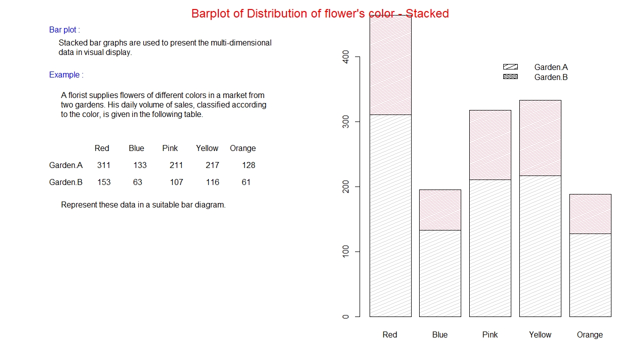
Stacked Bar graph:
In a side by side bar graph, frequency (total count) of the category is divided into groups or sub-category,
and it is not very convenient to read the total frequency of each category from the graph directly.
In such situation, a more efficient type of graph to consider is the stacked bar graph. In this graph,
as name suggests, the count of each member of the group or sub-category is piled up on top of the other.
The stacking process one on top of other continues as long as all the members of the group exhausted.
Example:
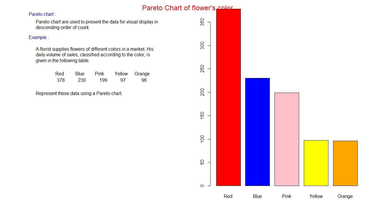
Pareto chart:
So far, we have discussed bar graph, and different types of bar graphs. Now we shall discuss a special
type of bar graph, which is called a Pareto chart. In this graph bars are arranged in descending order
of frequency, naturally heights of bars go on decreasing from left to right. This chart is used only for
nominal data, if it is used for ordinal data, order is messed in horizontal axis.
Example:
So far, we were discussing about the types of graphs used for qualitative data. Now we shall list some
of the graphs that are used for displaying quantitative data. Dot plot, Line graph, stem and leaf plot,
histogram, relative frequency histogram, scatter plot are the types of graphs that are used for displaying
quantitative data. Among them histogram and scatter plots are widely used. Each graphs are discussed in
detail with examples as follows:
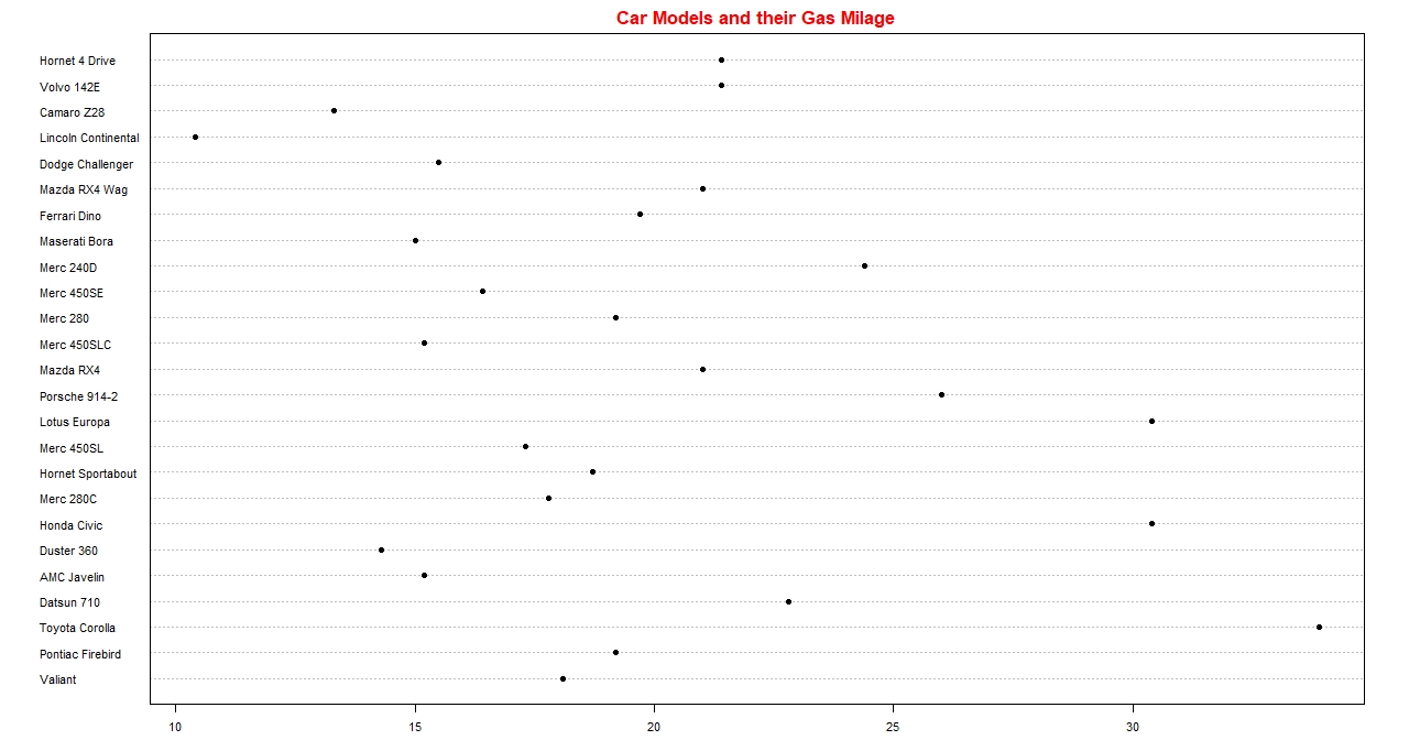
Dot Plot:
This is the plot of all the original data values along the number line. A dot for each data value be stacked
and it gets piled up above the number line.
Example:
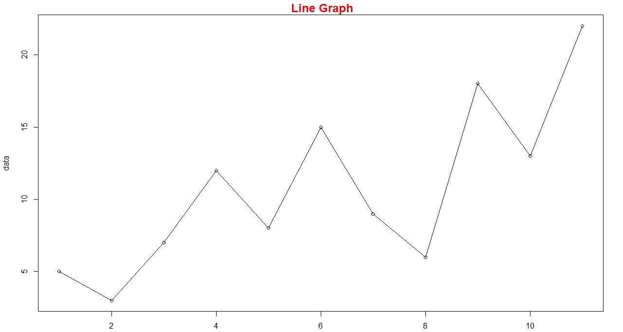
Line Graph:
It is similar to dot plot, only difference is the connecting line as the plotting proceeds.
Example:
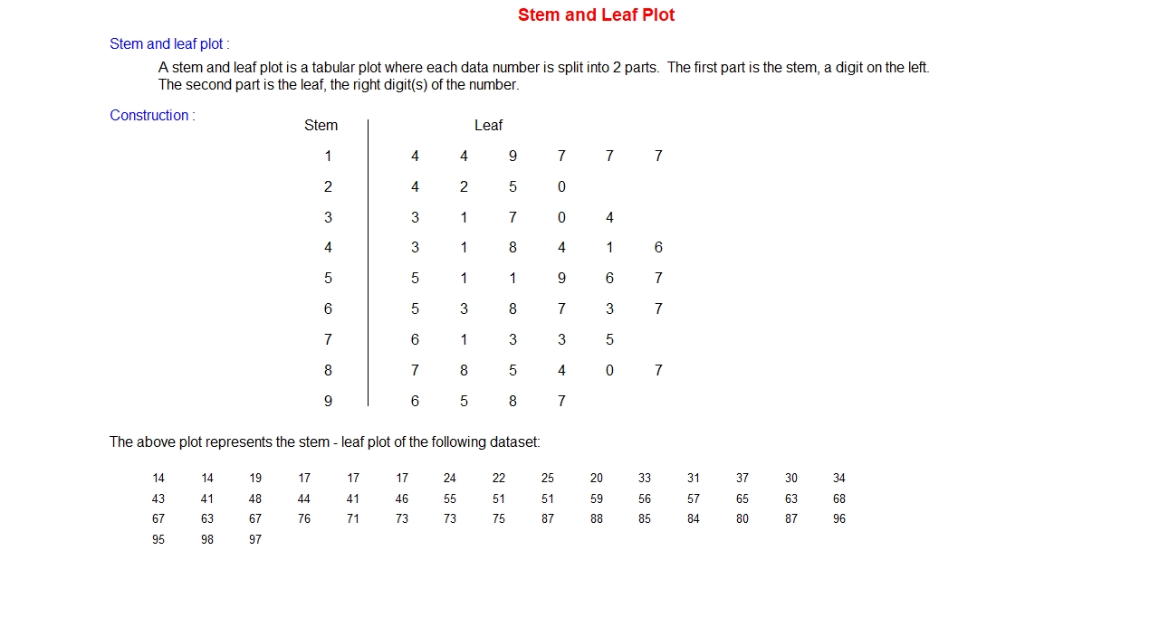
Stem and leaf Plot:
The idea of this plot is same as leaf and stem in a tree. This plot splits the digit of the
numbers in the data set into two parts, one for stem and other for leaf. A vertical line in
a plot separates the stem and leaves. The last significance digit in each data value is the
leaf and the remaining digit(s) are the stem. The process starts listing all stems, leaving
last digit for leaf, in a column. A vertical line is drawn to separate the stem and leaf.
Stem stays on the left of the vertical line and every occurrence of last digit is listed
horizontally against the corresponding stem one after another on the right side of the vertical line
called leaves.
Example:
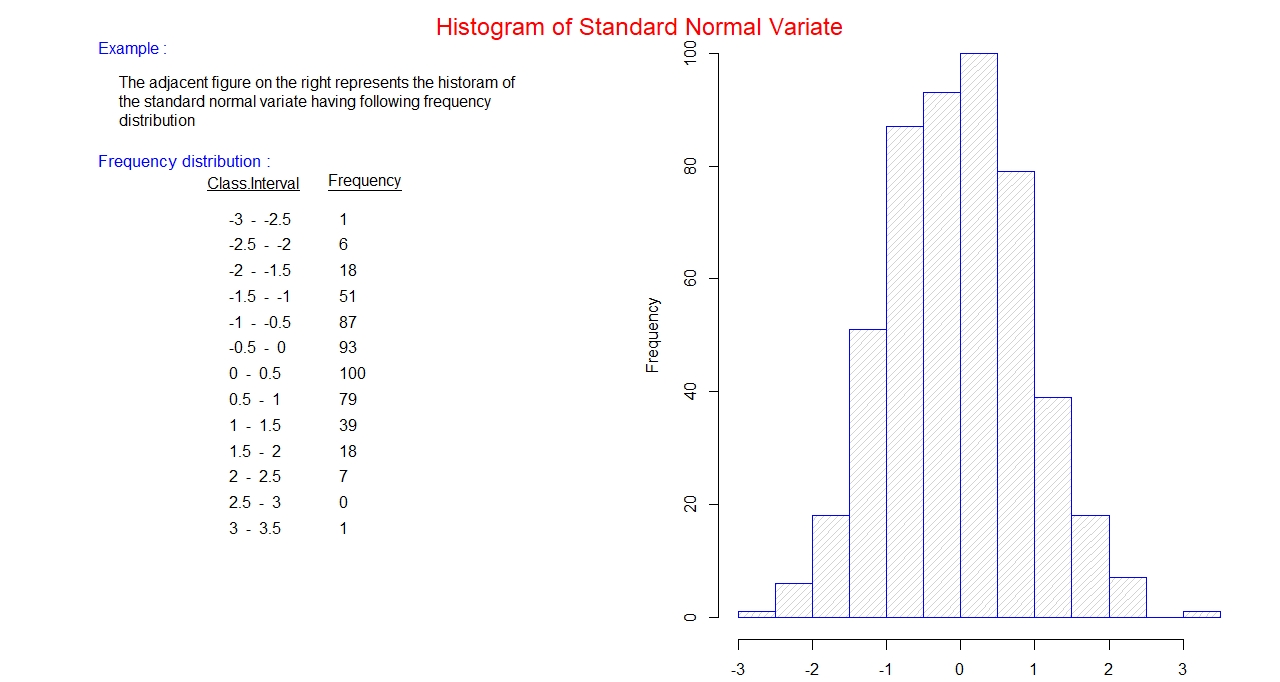
Histogram:
It is a plot of grouped frequency distribution, frequency along y-axis, against class interval
plotted along x-axis. All the class interval along x-axis are labeled, all the classes are
connected and has uniform width. A rectangular column is placed above each class with height
proportional to the frequency of the class.
Example:
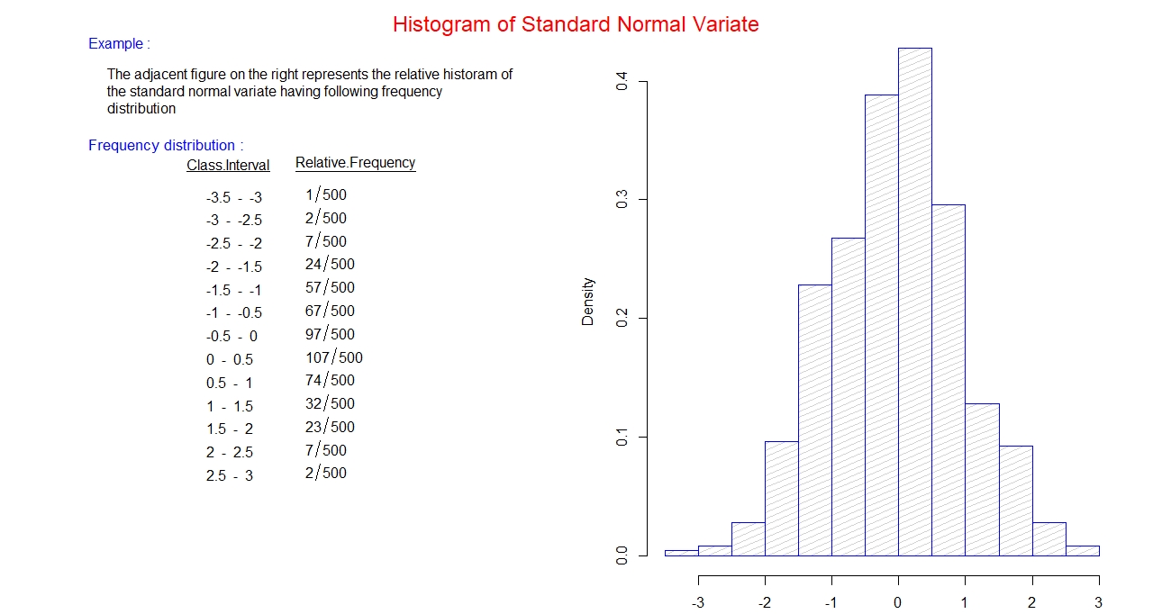
Relative Histogram:
It is a histogram in which the frequency along y-axis is replaced by the relative frequency.
Example:
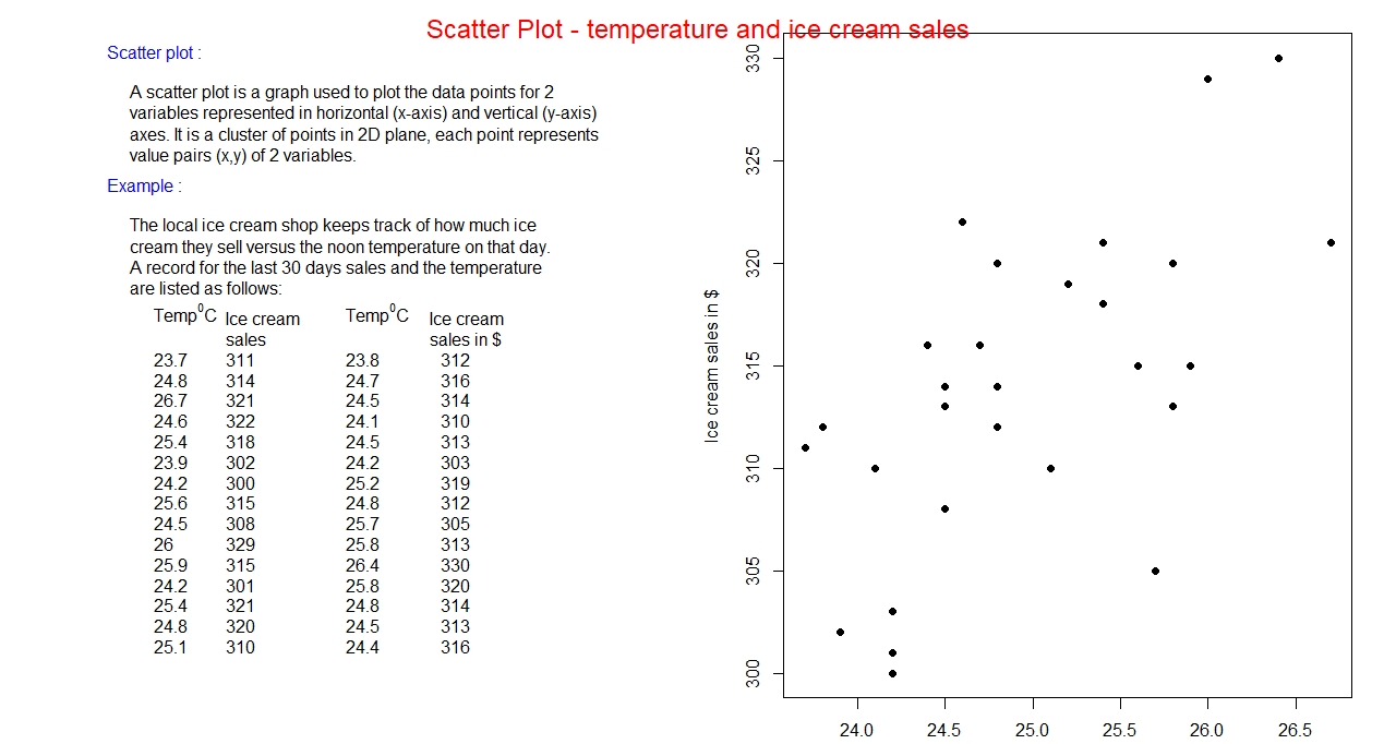
Scatter Plot:
It is a two-dimensional plot corresponding to two variables in the data set. One variable is plotted
along x-axis (horizontal) generally called independent variable; another variable is plotted along
y-axis (vertical) generally called dependent variable. Each pair (x, y) represents a point in the
2-dimensional plane. The aggregate of points in the plane corresponding to the data set constitute a scatter plot.
Example: